Designers live and breathe Pantone colors. Just one digit change can muddy a blue, mute a red or send a yellow to breathtaking heights. So, it makes sense that we wait for the Pantone color to emerge so we can talk about it, use it and even have our designs become that color for a moment until the next color moves in to take over our visual world.
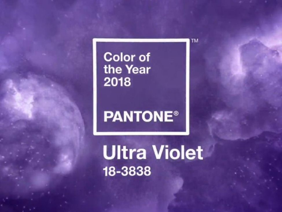
The Pantone color of the year has come to be a symbolic representation of what we need in our world or a statement about the world we live in. And we love this Pantone’s color of the year for our customers. We’re ready to see Ultra Violet popping up everywhere. Here’s why:
It’s a blend of two of our favorites
Combining the fierce urgency of red and the steadying calmness of blue, violet is the perfect, beautiful blend of two forces. With the rich fire of red behind it and the overlying stability of blue, violet reminds us of wisdom, grandeur and mystery.
We’ve loved you for years
Violet is the color of royalty worn by Roman emperors, Byzantine conquerors and the beloved rock star, Prince. It’s traditionally a rich, jewel-tone color that was expensive to create (hence, the royal interest) and so beautiful to behold. Its hues are vibrant in floral arrangements and are often selected by brides as a main color to offset the dazzling white of the bridal gown.
Pantone described it as inventive and imaginative
“Enigmatic purples have also long been symbolic of counterculture, unconventionality, and artistic brilliance. “ -Pantone Color of the Year Announcement
Color has power over our minds. It’s why so many advertisers spend scads of money to determine how consumers react to blues, reds, greens, yellows and the rest of the rainbow spectrum. Designers paint master bedrooms one color that invites peace and rest and another in the kitchen that helps people feel welcome and cozy.
Violet is a terrific choice for 2018 since visionary thinking should be a priority for all of us now that we’re settled into the new millennia.
It’s the perfect pop of color for your home
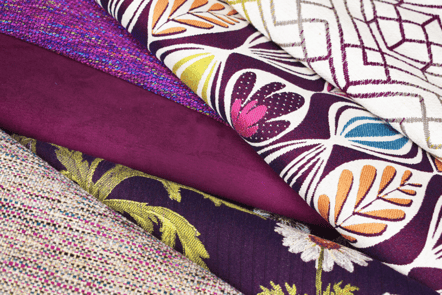
We love violet. We love it so much we were using it in our perfromance fabrics before it became Pantone’s color of the year. It’s a terrific complementary color to so many choices on the color wheel. We love to see its rich vibrancy on pillows, sofa cushions and curtains.
Where will you be seeing violet in your life in 2018?