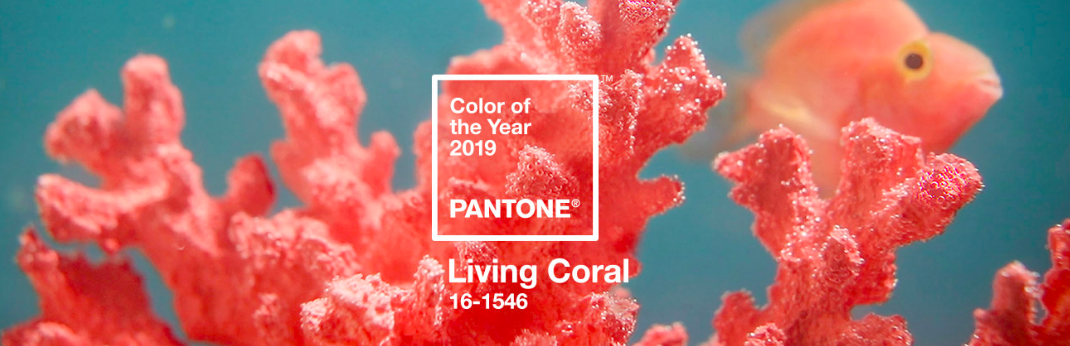
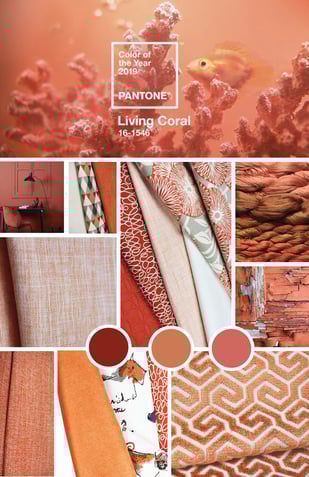
Color is such an integral part of our human experience and the announcement of Pantone’s Color of the Year never fails to generate a buzz among those in the design world. In 2019, the lucky winner selected by the Pantone Color Institute is Living Coral.
 Leatrice Eiseman, Director of the Pantone Color Institute, said this about the choice: “Color is an equalizing lens through which we experience our natural and digital realities, and this is particularly true for Living Coral.
With consumers craving human interaction and social connection, the humanizing and heartening qualities displayed by the convivial Pantone Living Coral hit a responsive chord.”
The Institute puts a lot of creative thought and energy into selecting the color of the year. Its selection makes big waves in the worlds of fashion, packaging design, and, you guessed it, home furnishings.
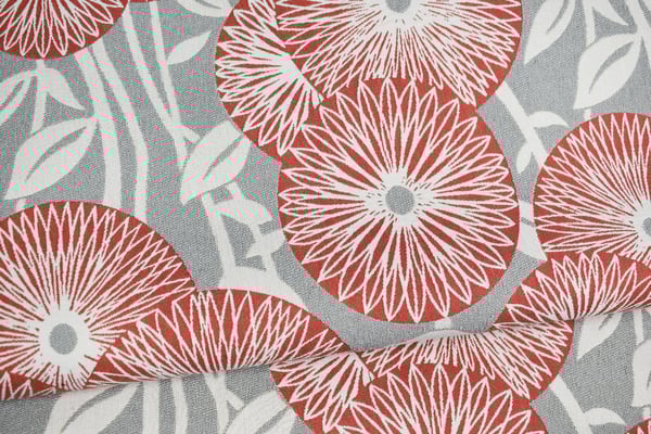
Pantone’s announcement stated that the “vibrant, yet mellow PANTONE 16-1546 Living Coral embraces us with warmth and nourishment to provide comfort and buoyancy in our continually shifting environment.”
.jpg?width=3951&name=Photo%20May%2019,%206%2012%2040%20PM%20(1).jpg)
It’s true. It seems that everyone we talk to is looking for a center; they are seeking a place of belonging in a world that is at once overly connected and isolated. The hue of Living Coral, with its golden undertones, is warm and inviting. At the same time, its name inspires us to consider the hundreds of thousands of individual animals who clump together to form a community reef in shallow, warm, clear waters. Basically, Living Color invites us into a calm, shared connectivity.
-1.jpg?width=320&name=Hollyann%20Tangelo%20group%20(2)-1.jpg)
According to Pantone, the color symbolizes “our innate need for optimism and joyful pursuits...[and] embodies our desire for playful expression.” Optimism and joy should always be in plentiful supply and we’re delighted to celebrate a color that promotes such qualities.
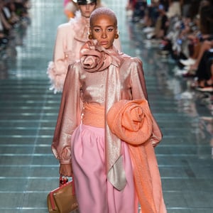
Where will we find the color? It’s already hitting the runway, according to Vogue. Marc Jacobs had models strutting their coral-laden stuff down the runway with his spring 2019 collection.
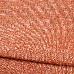
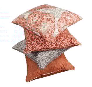
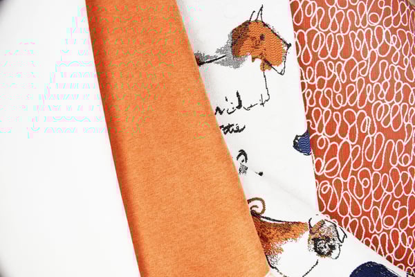
Don’t be surprised if you start seeing Living Coral pop up in wallpaper, paints, pillows and throws immediately. Everyone in the design world takes notice when Pantone makes its annual influential announcement.
We’re excited to see the creative ways that designers in every industry incorporate the hue into their individual spaces. Enchanting and intuitive; with soft neutral undertones, this color has a graceful, unassuming strength.
It is a hushed, atmospheric moment of stillness, with a warm natural beauty and quiet simplicity. I can’t wait to see where fabric design goes with this whisper of inspiration. I like the idea that Living Coral could (and probably should) stay spotless.